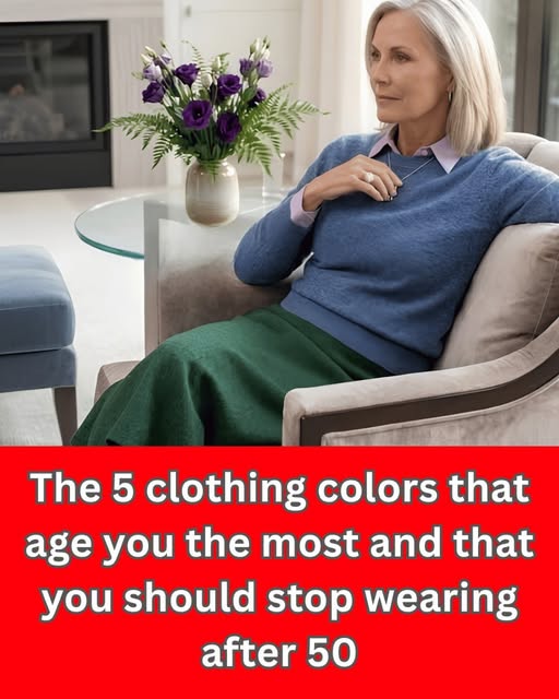
As we get older, our wardrobe can make a bigger difference in how fresh, vibrant, and radiant we look. The right clothing color can brighten the complexion, emphasize the eyes, and create a polished appearance, while the wrong shade may make the skin appear tired, dull, or washed out.
This doesn’t mean there are strict “good” or “bad” colors after 50. Every complexion is different, and factors such as skin undertone, hair color, eye color, and personal contrast all influence which shades look best. However, some colors tend to be particularly flattering when chosen thoughtfully.
Why Clothing Colors Can Look Different With Age
Over time, natural changes in skin tone, hair color, and overall facial contrast can affect the way clothing colors appear against the face.
A color that looked fantastic in your 30s may not have exactly the same effect later in life. Hair may become lighter or gray, the complexion may become less uniform, and natural contrast between the eyes, skin, and hair can change.
That is why choosing colors that add appropriate contrast and warmth can help create a more energized appearance.
The most important place to evaluate a color is near your face. A shade may look beautiful on a skirt, trousers, or shoes but have a completely different effect when worn as a blouse, sweater, scarf, or jacket.
1. Emerald Green
Emerald is one of the most versatile jewel tones. Its rich green color can create beautiful contrast with many complexions and make an outfit look sophisticated without being overly dramatic.
Try emerald in:
- Sweaters
- Blouses
- Dresses
- Scarves
- Cardigans
- Statement jackets
If bright emerald feels too intense, experiment with forest green or deep moss instead.
2. Sapphire and Deep Blue
Deep blue can be an excellent alternative to black. Sapphire, cobalt, navy, and rich royal blue can provide definition while still giving the outfit a lively appearance.
Blue is especially useful when you want something elegant enough for everyday wear but more visually interesting than basic neutrals.
A deep-blue blouse paired with cream trousers, for example, can create a sophisticated and timeless combination.
3. Burgundy and Wine
Rich reds such as burgundy, wine, and deep cranberry can add warmth and depth to an outfit.
These shades are particularly useful during cooler months and can work beautifully in sweaters, coats, dresses, and accessories.
If bright red feels too strong, burgundy offers a softer way to incorporate red into your wardrobe.
4. Plum and Deep Purple
Purple doesn’t have to mean bright violet. Deeper shades such as plum, aubergine, and berry can look elegant and luxurious.
These colors can be especially effective when you want something different from traditional black, navy, or brown.
Try a plum blouse with neutral trousers or a deep-purple cardigan over a simple cream outfit.
5. Teal
Teal sits between blue and green, making it a particularly interesting choice for anyone who finds traditional blue or green too predictable.
A rich teal can bring color to the face without necessarily appearing overly bright.
It works well for:
- Shirts
- Knitwear
- Dresses
- Scarves
- Lightweight jackets
6. Coral and Warm Rose
If your complexion looks best in warmer colors, coral, salmon, warm rose, and peachy shades may help create a lively appearance.
The trick is choosing a shade with enough richness. Extremely pale versions can sometimes have a washing-out effect, while a slightly deeper coral or warm rose can provide more definition.
7. Terracotta and Rust
Earthy shades such as terracotta, rust, burnt orange, and cinnamon can be beautiful alternatives to ordinary brown or beige.
They work particularly well for autumn-inspired wardrobes and can add warmth without requiring bright colors.
If orange feels intimidating, start with a small accessory such as a scarf or handbag before wearing it near your face.
8. Cream Instead of Stark White
White isn’t necessarily unflattering, but some people find very bright white harsh against their complexion.
Cream, ivory, oatmeal, and soft off-white can provide a gentler contrast.
These shades are also incredibly easy to combine with richer colors such as navy, burgundy, emerald, chocolate brown, and teal.
9. Camel Instead of Pale Beige
Beige can sometimes blend too closely with the skin, particularly when the shade is very pale or grayish.
Camel, warm tan, caramel, and honey-colored neutrals usually provide more definition.
You don’t have to eliminate beige from your wardrobe. Simply try different undertones and compare them in natural daylight.
What About Gray?
Gray is another color that depends heavily on the individual.
Cool, pale gray worn directly underneath the face can sometimes make the complexion appear less vibrant. However, charcoal, slate, pewter, and warmer gray shades can look extremely elegant.
If gray is one of your favorite colors, you don’t need to give it up. Consider pairing it with a richer color such as:
- Burgundy
- Emerald
- Teal
- Cobalt
- Plum
- Berry
This prevents the entire outfit from looking overly muted.
Be Careful With Extremely Neon Shades
Neon colors are not automatically unflattering after 50, but they can be overpowering.
Very bright fluorescent yellow, green, pink, or orange can sometimes draw attention to the clothing rather than the face.
If you love vibrant colors, consider using them strategically. A neon-colored handbag, shoe, bracelet, or scarf can provide a fun pop of color without overwhelming your overall appearance.
The Importance of Your Skin Undertone
Your undertone can be more important than your age when selecting clothing colors.
Warm undertones
People with warm undertones often enjoy colors such as:
- Camel
- Terracotta
- Coral
- Rust
- Olive
- Warm red
- Golden beige
- Chocolate brown
Cool undertones
Cooler undertones may work particularly well with:
- Sapphire
- Emerald
- Plum
- Berry
- Cool pink
- Blue-red
- Charcoal
- Navy
Neutral undertones
If you have a neutral undertone, you may be able to wear a broader range of both warm and cool colors.
The easiest way to determine what works is to compare several shades beside your face in natural light.
Don’t Forget About Contrast
Color isn’t only about undertone. Contrast matters too.
If your hair, skin, and eyes have relatively similar levels of lightness, extremely dark colors may create a dramatic contrast. On the other hand, if you naturally have high contrast, deeper and more saturated colors may look particularly striking.
This is why two people of the same age and similar skin tone can look completely different in the same blouse.
A Simple Test for Finding Your Best Colors
You don’t need to replace your entire wardrobe.
Try this simple test:
- Stand near a window in natural daylight.
- Hold a few different colored garments underneath your face.
- Compare a muted shade with a richer shade.
- Look at your complexion rather than the clothing.
- Notice which color makes your eyes appear clearer.
- Look for the shade that makes your skin appear more even and lively.
- Choose colors that make you feel confident as well.
Your best color is often the one that makes you look noticeable—not the clothing.
You Don’t Have to Give Up Your Favorite Colors
Fashion advice about dressing after 50 should never become a list of restrictions.
If you love beige, wear beige. If gray is your signature color, keep it. If you adore bright pink, there is no reason to remove it from your wardrobe simply because you’re over 50.
Instead, consider where and how you wear the color.
For example, if pale beige makes your complexion look washed out, you can wear it in trousers or a skirt while choosing a richer color for the top.
Likewise, if black feels too harsh around your face, keep your black pants and combine them with a colorful blouse, scarf, or jacket.
The Bottom Line
After 50, clothing colors can be a surprisingly simple way to refresh your appearance. Rich jewel tones such as emerald, sapphire, burgundy, plum, and teal, along with warm shades such as coral, terracotta, camel, and cream, can add depth and visual interest to your wardrobe.
But there is no universal color rule based on age.
The best approach is to pay attention to your own complexion, undertone, hair, eyes, and natural contrast. Instead of asking, “Is this color too old for me?” ask, “Does this color make me look bright, healthy, and confident?”
That shift can make getting dressed much easier—and much more enjoyable.